The Directors Cut Pizzeria
THE BRIEF
The Directors Cut Pizzeria required a brand identity that fused the cinematic world of film production with the artisan craft of high-quality pizza. The objective was to create a visual system that moved away from traditional Italian restaurant aesthetics, opting instead for a bold, authoritative, and theatrical experience. The brand needed to work across diverse touchpoints, including digital interfaces, apparel, and packaging.
THE SOLUTION
The visual identity is anchored in a high-contrast, "Director’s Board" aesthetic. By using a minimalist monochrome base with strategic pops of vibrant red, the brand achieves a sophisticated yet high-energy feel that mimics the drama of a film set.
Branding & Typography: I developed a typographic system using a heavy, sans-serif headline font reminiscent of classic cinema credits. This is paired with an iconographic style that uses framing markers and "take board" motifs to frame the products as the "feature presentation."
Visual Strategy: I utilised a dark-mode first design approach, leveraging deep blacks and high-contrast whites to evoke the atmosphere of a dark cinema. This allows the photography and the vibrant red accents—symbolising both the heat of the oven and the "Record" light of a camera—to stand out.
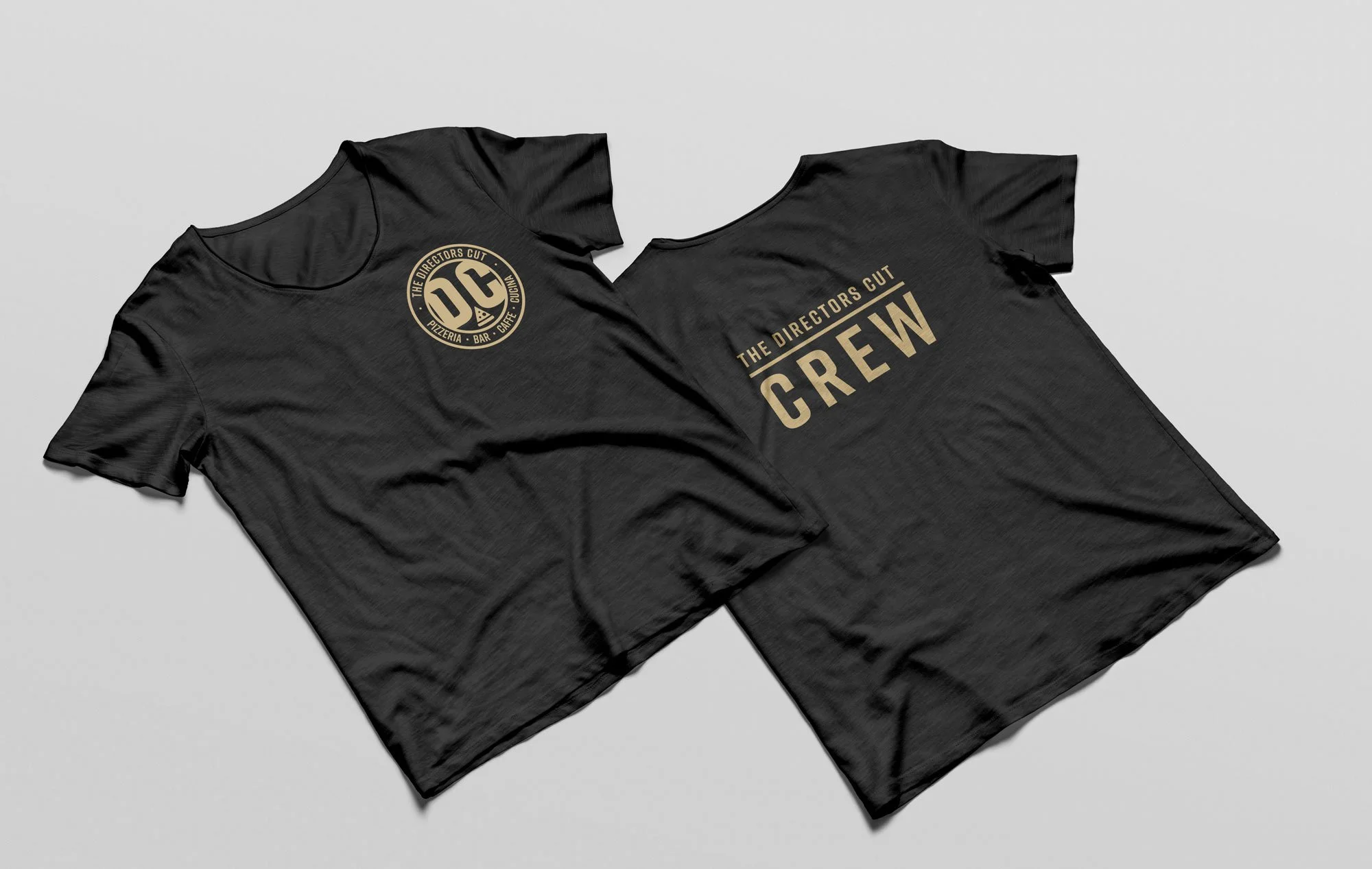
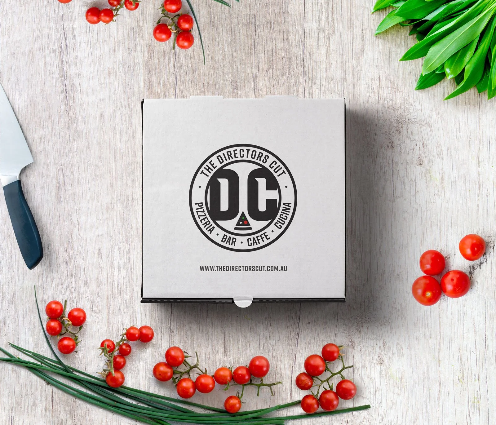
Physical Assets: The brand was extended into tangible products, including apparel and custom pizza box packaging. These items maintain the stark, high-contrast visual language, ensuring the brand remains instantly recognisable from the digital screen to the customer's front door.
Iconography: Custom icons were created to represent menu items and service features, designed with thin, clean lines that balance the weight of the primary brand typography.
SERVICES
Brand Identity, Typography, Packaging Design, Apparel Design